Overcast Moody
A muted, slightly cool Classic Chrome recipe built for overcast city days — deep shadows, restrained colour, and the documentary weight grey light deserves.
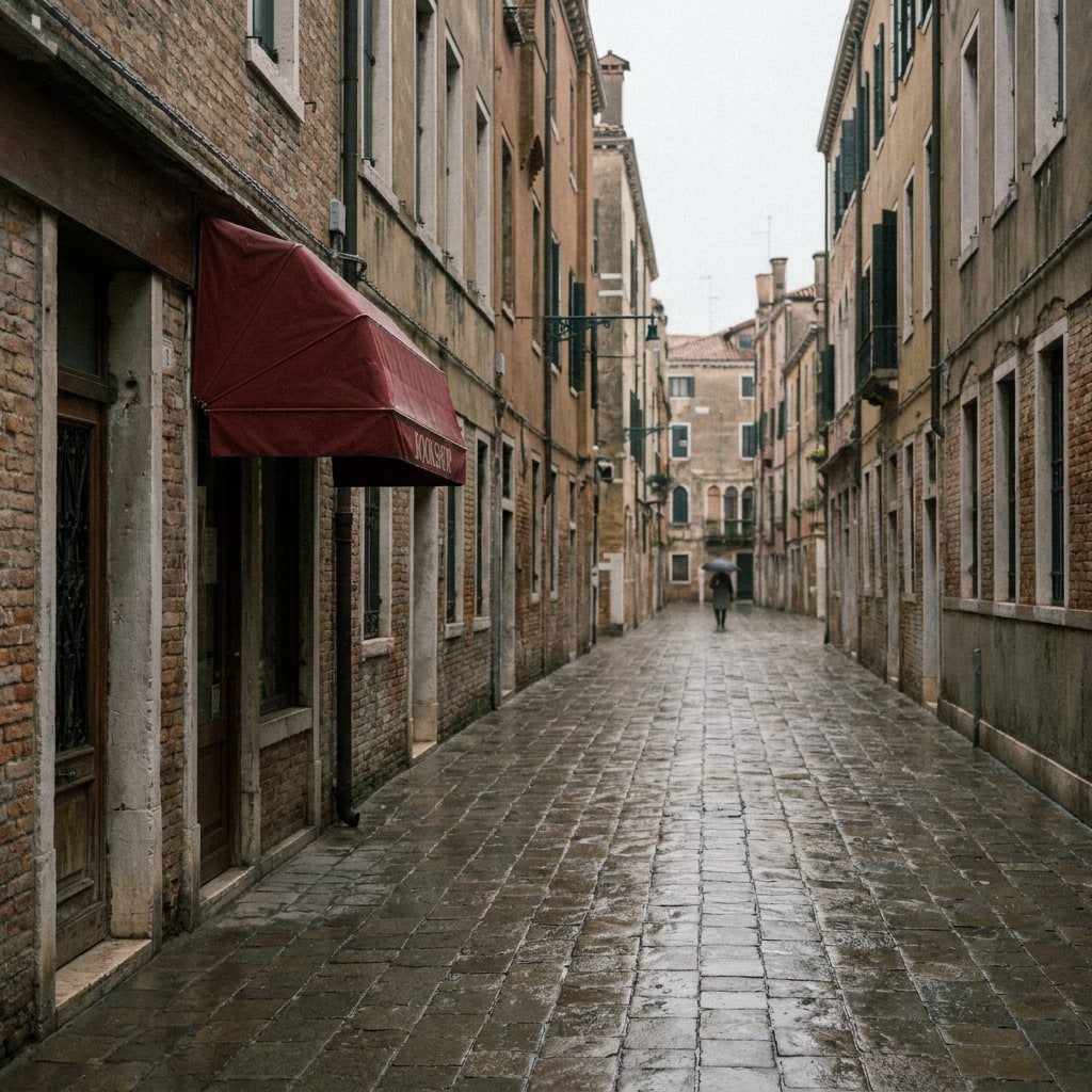
Sample look
What this recipe is reaching for
A representative scene in the Classic Chrome editorial / overcast documentary register this recipe targets — the colour, contrast, and mood it tries to land straight out of camera.
AI-rendered approximation (Gemini 3 Pro Image, prompted with the recipe's Fuji simulation and settings). Not a photograph shot with this recipe — real shots will vary with your light and subject.
Settings
15 parameters · How to load these →
Look
- Film Simulation
- Classic Chrome
- Dynamic Range
- DR200
Tone
- Highlight
- +1
- Shadow
- +2
Color
- Color
- −1
- White Balance
- Daylight (5500K)
- WB Shift
- Red −2 · Blue +2
- Color Chrome FX
- Strong
- Color Chrome FX Blue
- Weak
Detail
- Sharpness
- 0
- Noise Reduction
- −2
- Clarity
- +2
Texture
- Grain Effect
- Weak, Small
Exposure
- ISO
- Auto, up to ISO 6400
- Exposure Comp.
- -2/3 to -1/3 EV
Overcast light is the most honest light a city ever gets — flat, directional only in the broadest sense, and almost monochrome by default. Classic Chrome was designed around exactly this kind of muted reportage palette, with its desaturated reds and slightly olive greens, so the job of this recipe is to push it further in the direction the weather is already going rather than fight back toward saturation.
Why this base
Classic Chrome’s restrained colour science already mutes the scene; Color -1 takes it one notch further without flattening skin tones into cardboard. DR200 is the deliberate choice over DR400 here — overcast skies rarely blow out, and DR200 keeps midtone contrast where DR400 would lift the greys and kill the mood. Color Chrome Effect Strong is what gives the recipe its weight: it deepens the dense colours (a red coat, a green awning, brick) against the otherwise washed scene, which is the editorial trick that separates a moody frame from a dull one. Color Chrome FX Blue on Weak nudges the sky and shadowed concrete a touch deeper without tinting the whole image cyan.
How to shoot it
Meter for the highlights and let the -2/3 to -1/3 EV compensation hold the sky’s tonality — Fuji’s evaluative meter will otherwise lift the scene back to neutral grey and wash the atmosphere out. Shadow +2 with Highlight +1 is the contrast curve doing the heavy lifting: blacks get density, skies stay closed-down, and the midtones compress slightly toward that documentary-print feel. The Daylight WB locked at 5500K with -2 Red / +2 Blue produces a consistent cool cast across an entire walk, which Auto WB would erase frame by frame. Clarity +2 adds a perceptible micro-contrast bite that suits wet pavement, brick, and fabric textures without veering into HDR territory; drop it to 0 if faces are central to the frame.
What to avoid
Don’t take this recipe into sun. The cool WB shift and -1 Color will make warm late-afternoon light look sickly rather than golden — that’s a different recipe entirely. Avoid pushing Noise Reduction back up if you raise ISO; NR -2 with Grain Weak/Small is part of what gives the files their slightly etched, print-like surface, and softening it pulls the image back toward generic digital. Finally, resist the temptation to add saturation in post: the whole point of the look is that the weather, not the colour, is carrying the frame.
How it compares
Grey-sky shooting now has three registers in the library. This recipe is the documentary one — muted colour with documentary weight. Eterna Overcast trades that weight for cinema softness: lifted shadows and a flatter curve that treats the grey as atmosphere rather than subject. And HP5 Plus removes the colour question entirely — the forgiving monochrome answer to the same weather. The full set lives on the overcast hub.
This recipe is the Fujifilm translation of Blade Runner 2049 — the full breakdown of what makes that look, and how these settings reach it, lives on its look page.
This recipe is the Fujifilm translation of Wes Anderson — the full breakdown of what makes that look, and how these settings reach it, lives on its look page.
Questions
4 answers
Overcast light is flatter than it looks to the meter — Fuji's matrix tends to lift midtones toward 18% grey and wash out the mood. Dialling -2/3 to -1/3 EV keeps the sky a believable pewter and lets the Shadow +2 setting do its work without crushing detail.
Not as written. The X-T3 has no Classic Chrome rendering parity issues, but it lacks the Clarity control used here and renders Color Chrome FX Blue differently. You can approximate the look by dropping Clarity entirely and leaving FX Blue off.
Skip it in direct hard sun or at golden hour — the -1 Color and cool WB shift will make warm light look anemic. It's tuned for flat, diffuse, top-down overcast where you want the weather to read as a subject, not a problem.
Fixing WB at 5500K with a -2 Red / +2 Blue shift gives the scene a consistent, slightly cool documentary cast across a whole walk. Auto WB will fight you, neutralising the very blue-grey atmosphere you're trying to keep.