Wes Anderson
on Fujifilm
Pastel pinks and turquoise greens. Centred symmetry. A dead-on, mid-distance camera. The Wes Anderson palette is one of the most-imitated in twenty-first-century cinema — here's what the colour grade actually does, and the Fujifilm recipe that translates it for stills.
Director of The Grand Budapest Hotel (2014), The French Dispatch (2021), Asteroid City (2023). Colourist Andy Hill (Asteroid City) and Lol Crawley (cinematographer) defined the late-period high-pastel palette.
Reference look
What we're translating
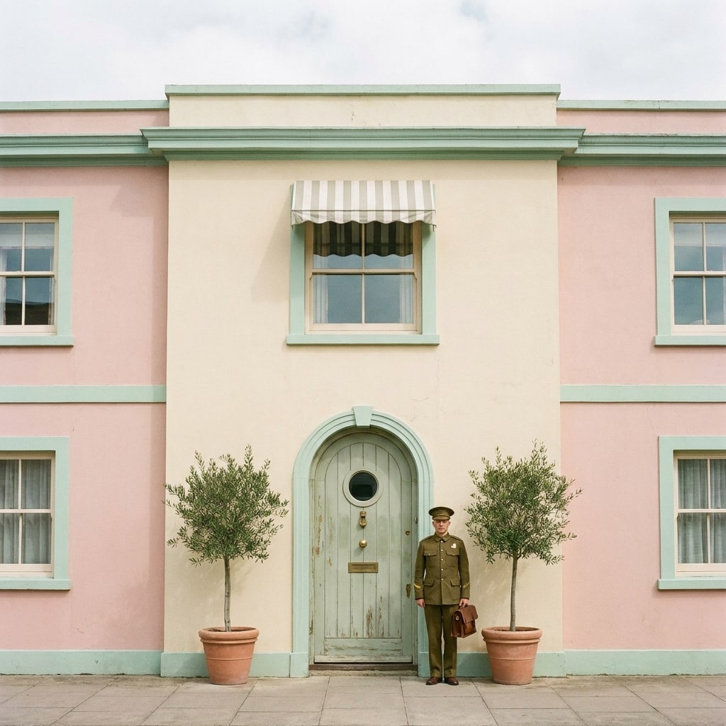
A representative scene in the Wes Anderson register — the colour, contrast, and composition the recipes below try to land on a Fujifilm body straight out of camera.
AI-rendered approximation (Gemini 3 Pro Image, prompted to match the Wes Anderson aesthetic). Not a frame from the source material — used for visual orientation only.
What people mean by “Wes Anderson look”
The Wes Anderson palette isn’t one look — it’s a discipline applied across multiple film stocks. The early films (Rushmore, Royal Tenenbaums) shot on cheap colour negative pushed toward yellow-green. The Grand Budapest Hotel moved to Mendl’s pink, mint, and lavender. Asteroid City added the bleached desert pastels: bone, mustard, sage.
What stays constant across the catalogue:
- A pastel-shifted midtone — colours are present but never saturated; nothing punches.
- Greens that lean blue-green / mint rather than emerald.
- A warm-cool axis — skin sits warm, walls and backgrounds sit cool. This is the colour-script trick that makes faces read against architecture.
- Held-back contrast — the look is not low-contrast (early-2010s “matte filter”) but it never crushes blacks. Shadows lift to slate, not full black.
The Fuji translation is closer than you’d expect. Classic Chrome is already in the right neighbourhood — pastel-leaning, warm-cool split, held-back contrast — it just needs the right shifts.
The translation
Three moves on a Fuji sensor:
- Classic Chrome with positive red WB shift — pushes the warm-cool split. (Pro Neg Std is the runner-up for the more bleached Asteroid City end of the catalogue.)
- Held-back dynamic range — DR200, not DR400. The flat highlights of post-Anderson colour grades aren’t from DR; they’re from grade.
- Slightly negative shadow + slightly negative colour — lifts blacks toward slate, mutes overall saturation so the pastel reads.
The recipes below — Overcast Moody for the high-pastel Grand Budapest end, Kodak Gold for the warmer Asteroid City desert end — translate it for X-Trans IV and V.
Why this isn’t just a pastel filter
A pastel filter desaturates everything. The Anderson grade keeps selective saturation on the warm side of skin and on accent colours (Mendl’s pink, the Tenenbaum jacket reds) while pulling blue-green-violet toward grey. That’s why a flat pastel filter looks wrong — it kills the accents the grade is built around.
On a Fuji body you can’t replicate the per-channel grade in-camera, but biasing white-balance warm + holding saturation low approximates it close enough that the eye reads it as “Anderson-adjacent.” For straight-out-of-camera street work, that’s the goal.
What to look for
A real Wes Anderson translation, not a generic pastel:
- Skin reads slightly warm against neutral architecture.
- Greens lean mint or sage, never forest emerald.
- Shadows sit on slate, not black.
- Saturated accents (a red door, a pink wall) still punch — they’re not muted with everything else.
Recipes that deliver it
2 recipes · ready to shoot
-
Emulates Classic Chrome editorial / overcast documentary
Overcast Moody
A muted, slightly cool Classic Chrome recipe built for overcast city days — deep shadows, restrained colour, and the documentary weight grey light deserves.
-
Emulates Kodak Gold 200
Kodak Gold 200
A warm, lightly grainy Kodak Gold 200 emulation built on Classic Negative — friendly skin, golden afternoon light, and saturated blue skies.