Eterna Overcast
A soft cinematic Eterna recipe for overcast and lightly rainy days — lifted shadows, low saturation, and a cool cast for wet streets and muted architecture.
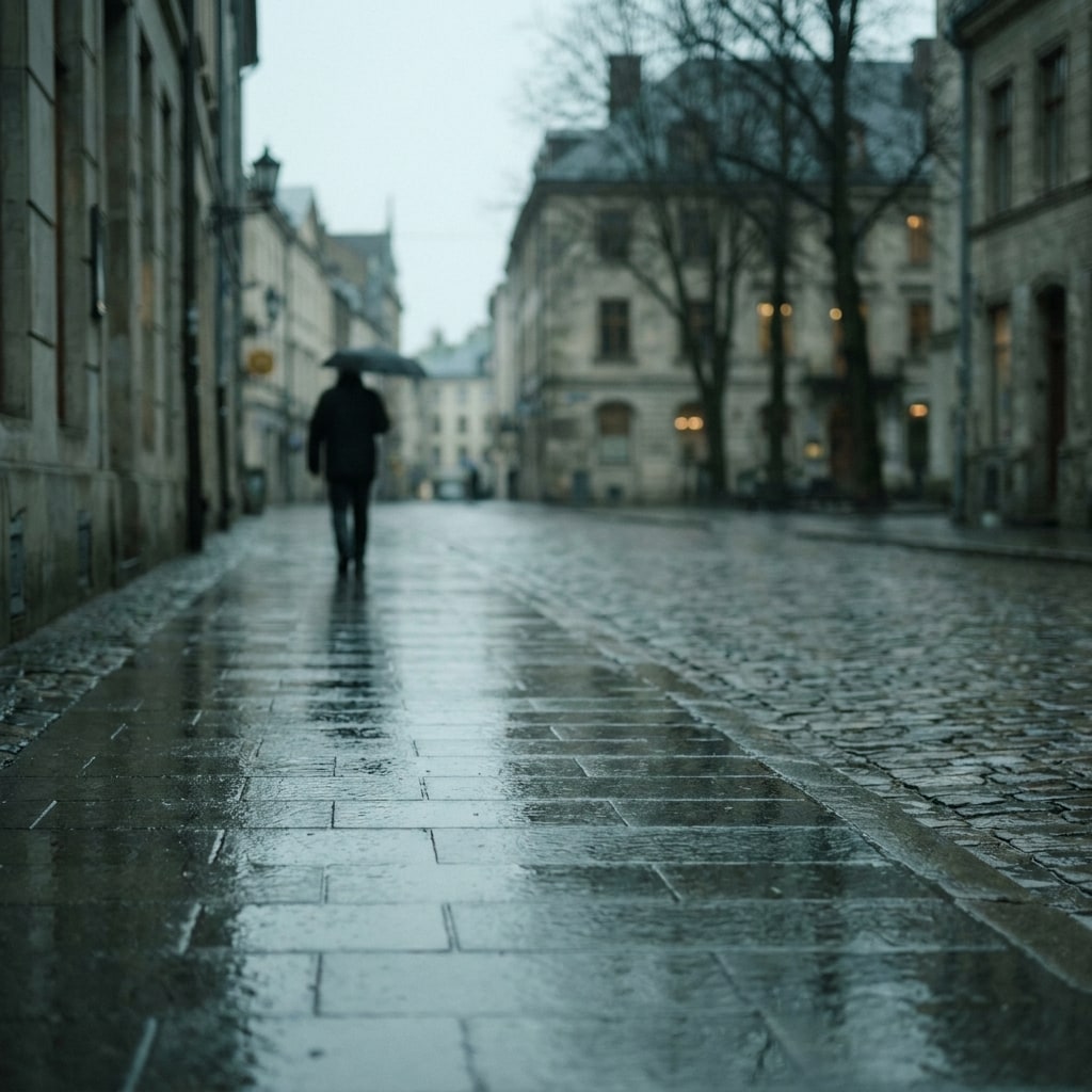
Sample look
What this recipe is reaching for
A representative scene in the Eterna cinema stock under flat daylight register this recipe targets — the colour, contrast, and mood it tries to land straight out of camera.
AI-rendered approximation (Gemini 3 Pro Image, prompted with the recipe's Fuji simulation and settings). Not a photograph shot with this recipe — real shots will vary with your light and subject.
Settings
15 parameters · How to load these →
Look
- Film Simulation
- Eterna / Cinema
- Dynamic Range
- DR400
Tone
- Highlight
- −1
- Shadow
- −2
Color
- Color
- −1
- White Balance
- Daylight (5500K)
- WB Shift
- Red −2 · Blue +2
- Color Chrome FX
- Weak
- Color Chrome FX Blue
- Weak
Detail
- Sharpness
- −2
- Noise Reduction
- −4
- Clarity
- −3
Texture
- Grain Effect
- Weak, Small
Exposure
- ISO
- Auto, up to ISO 6400
- Exposure Comp.
- +1/3 to +2/3 EV
Overcast light is already doing half the work of a cinema look — flat contrast, cool cast, no hard shadows — and Eterna is the film simulation built to receive it. This recipe leans into that: a quiet, slightly cool palette where wet asphalt, stone facades, and muted jackets all sit in the same tonal register, and faces emerge softly rather than punching out of the frame.
Why this base
Eterna’s native curve already compresses highlights and lifts shadows, which is why it reads as cinematic even before any tweaking. Pushing Shadow to −2 opens the darks further so rain-soaked pavement keeps texture instead of blocking up, and Highlight −1 protects the flat grey sky from going chalky. DR400 widens that working range so even a sudden break in the clouds won’t blow out — useful when light shifts minute to minute under moving weather.
Color at −1 pulls an already-desaturated film simulation a step further toward muted, and the −2 Red / +2 Blue WB shift on a Daylight 5500K base introduces the slight cool cast that defines the melancholy-grey-day mood without tipping into full teal. Color Chrome Effect WEAK and Color Chrome FX Blue WEAK quietly deepen the few saturated accents in the scene — a red umbrella, a blue shop awning — so the frame isn’t entirely dead, just restrained.
How to shoot it
Meter for the scene and dial in +1/3 to +2/3 EV compensation. Overcast skies fool the meter into underexposing, and this recipe is built to sit a touch bright — that’s what gives skin its softness and keeps the shadows readable. Shoot it at base ISO when you can, but the WEAK / SMALL grain and Noise Reduction at −4 mean ISO 1600–6400 still looks filmic rather than noisy; the grain texture actually helps the wet-street surfaces.
Clarity −3 is doing real cinematic work here: it softens micro-contrast in textures (brick, fabric, hair) without blurring edges, which is what separates this look from a sharp documentary frame. Sharpness −2 supports that — keep the image gentle.
What to avoid
Don’t use this in direct hard sun. The lifted shadows and DR400 will produce a flat, washed-out file when contrast is already low in the scene because of bright top light — this recipe needs the diffuse overhead light of cloud cover to make sense. Equally, resist the urge to add saturation back; the muted palette is the point, and Color Chrome FX Blue WEAK is already doing the heavy lifting on any blue accents in the frame.
How it compares
Two Eterna-family neighbours pull this look in opposite directions. Eterna Bleach Bypass is the hard cut: colour drained further, contrast pushed up, metallic highlights — the thriller grade to this recipe’s melancholy drama, on the same rain-and-concrete subjects. In the other direction, CineStill 400D keeps the soft cinematic curve but warms it for actual sunlight. For grey days that want documentary bite instead of cinema softness, Overcast Moody is the Classic Chrome answer.
This recipe is the Fujifilm translation of Blade Runner 2049 — the full breakdown of what makes that look, and how these settings reach it, lives on its look page.
Questions
4 answers
DR400 isn't only for bright skies — it lifts the toe of the curve and softens the transition into the highlights, which is exactly what gives wet pavement and pale sky their painterly, low-contrast separation here.
Not as written. The X-T3 lacks Clarity and Color Chrome FX Blue, both of which are doing real work in this look. You can approximate it by dropping Clarity entirely and accepting slightly cooler blues, but it won't match.
They shouldn't. The −2 Red / +2 Blue shift is mild and the Color setting at −1 keeps skin desaturated but still warm enough; combined with +1/3 to +2/3 EV, faces stay readable against grey backgrounds.
Clarity −3 softens micro-contrast in wet textures so the image reads cinematic rather than clinical, and NR −4 keeps fine grain visible so the WEAK grain setting actually shows through.