Kodachrome
on Fujifilm
The most decorated colour positive in photographic history. Saturated reds, deep blues, a held-back midtone — the look that defined twentieth-century travel reportage. Here's what made Kodachrome feel like Kodachrome, and the Fujifilm recipe that translates it onto X-Trans.
Kodak's 1935–2010 colour reversal film, discontinued because its proprietary K-14 processing line shut down. Defined the look of National Geographic from the 1940s through the 1980s.
Reference look
What we're translating
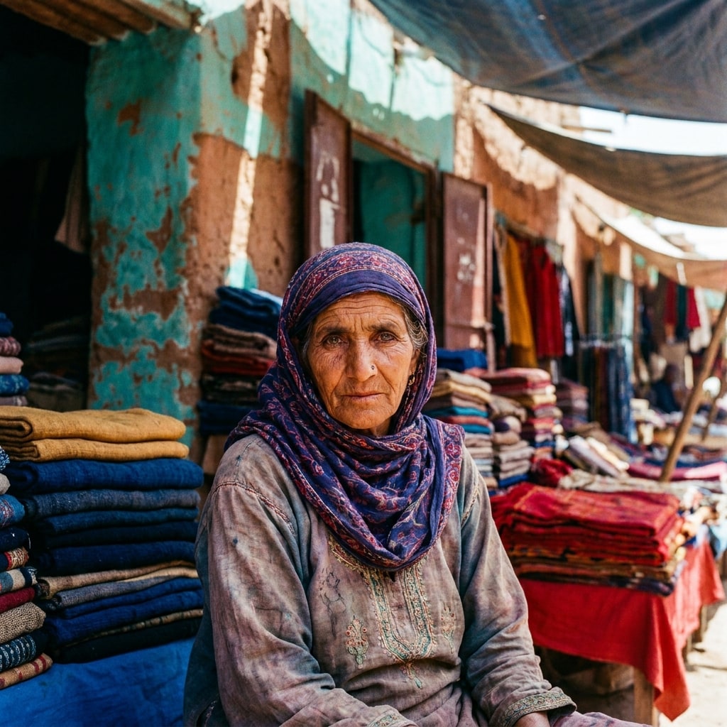
A representative scene in the Kodachrome register — the colour, contrast, and composition the recipes below try to land on a Fujifilm body straight out of camera.
AI-rendered approximation (Gemini 3 Pro Image, prompted to match the Kodachrome aesthetic). Not a frame from the source material — used for visual orientation only.
What people mean by “Kodachrome look”
Kodachrome was a colour positive — slide film, not negative — and that single fact governs the look. Slides have dense, saturated colour built into the emulsion (no print stage to soften it), narrow exposure latitude (about three stops, so highlights clip hard), and a famously distinctive red channel that ran hotter than blue or green at the same exposure.
The look that lives under “Kodachrome” in the popular memory — Steve McCurry’s Afghan Girl, Eric Lafforgue’s Iran, half of National Geographic’s back catalogue — is saturated, contrasty, and red-leaning in ways that make modern digital files look pale. Three moves get you close on a Fuji sensor:
- A film simulation with assertive contrast and warm bias — Classic Chrome is the obvious match (Pro Neg Hi pushed warm is the runner-up; Velvia is too far into landscape territory).
- Held-back dynamic range — DR200 keeps highlights tight where Portra-style recipes hold them loose. Kodachrome clipped; Fuji shouldn’t pretend it didn’t.
- Positive red WB shift + slight positive colour — the red channel needs the extra push, but global saturation stays moderate so blues don’t go cyan.
That’s the spec. The Fuji recipe below translates it for X-Trans IV and V bodies.
Why this is hard to fake with presets
A Kodachrome preset in Lightroom can paint the curve and the colour shifts, but it cannot reproduce Kodachrome’s microcontrast — the local sharpness of saturated edges in the original emulsion. On a Fuji body, the closest substitute is slightly positive sharpness + minimal noise reduction, letting the X-Trans sensor’s own crunch read where the film grain used to.
What to look for
A real Kodachrome translation, not just a warm filter:
- Reds are noticeably hotter than blues at the same exposure.
- Skies stay deep instead of going pastel.
- Highlights on white shirts clip cleanly — not a smooth roll-off.
- Shadows hold dense, blue-leaning blacks (not crushed, not lifted).
If the result looks “vintage warm” instead of “saturated and specific,” the recipe is delivering Instagram retro, not Kodachrome.
Recipes that deliver it
1 recipe · ready to shoot